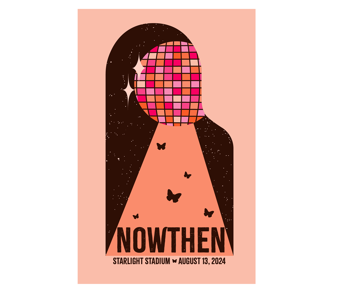
Poster Perfect: Nowthen Gig Design

Concept and Objectives
This project required we make a gig poster for a fake band. We needed to have a band name, gig place, time and date. This poster should also include texture and the text should be incorporated into the design. One of the most difficult parts for me was coming up with a band name. In the end I picked the name of a small town near me in Minnesota. The theme I tried to implement in my poster is girly, spunky, fun and happy music.
Sketches - Round 1
The first round of sketching, I decided on my audience and theme. I catered this poster to girls who probably enjoy listening to Taylor Swift. My poster is girly, spunky, and fun. I took these words and brainstormed a whole bunch of things that could fall in each category, I then drew out some of my favorite elements I might want to include and even sketched out a couple compositions. I ended up really liking the disco ball with the butterflies.

Drafting - Round 1
I found a very basic hourglass composition to use on this poster and got on illustrator. I thought it would be cool to have a floral background and the text inside the light of the disco ball. The flowers were way too busy, and I couldn't figure out where to fit in my text, everything just looked so awkward! I decided I liked the hot pink and orange color scheme though.


Class
That week in class my instructor suggested we find a composition we liked and a style we liked, then put the two together. This opened my eyes to so many more possibilities! I found a style I liked (Kiwanuka on left) and used Illustrator's AI Generative Recolor tool to create a poster with colors I thought fit better with my audience. I ended up with the poster in the middle and was really excited about it. I found this Herbie Hancoch poster to pull my composition from and started the drafting process all over again.

Sketching - Round 2
So, I began sketching again. I tried to fit the Disco ball right where the planet was, but it didn't feel right, so I put it up top instead!

Drafting - Round 2
Putting the Disco ball up top looked better, but it still didn't look right. I felt that it was a very plain poster and didn't have great hierarchy. At this point I turned to my classmates and instructor for feedback. My instructor said that the planets composition works well because there are things falling off the page, so I decided to push the disco ball to the right. I also got advice to change the colors up to create more value contrast. I made the cutout shape brown and also used brown lines on the disco ball instead of the white. This draws the attention more to the pink disco ball because the value contrast is so great. I went back to my original design and added the light falling down from the disco ball to help more with hierarchy. This works well because the diagonal lines point right up to the disco ball. I finished up with some texture and fit my text into the design by stretching out the cutout vertically.

Objectives
My gig poster hit the objective because I made a gig poster for my audience. I created a color scheme that would draw in girls who are spunky and fun. The poster captures the theme of the music by being fun and girly with the butterflies and sparkles, and spunky with the disco ball. The elements fit well in my composition to create hierarchy that draws the attention of the viewer first to the disco ball, then the text at the bottom. These are all aspects of a good gig poster and mine fits great.
Final Image


